Topics
Skill Checklist
Track your progress across all skills in your objective. Mark your confidence level and identify areas to focus on.
29 Skills Available
Track your progress:
Don't know
Working on it
Confident
📖 = included in formula booklet • 🚫 = not in formula booklet
Track your progress:
Don't know
Working on it
Confident
📖 = included in formula booklet • 🚫 = not in formula booklet
Population & Data
12 skills
Population
SL 4.1
A population is the entire group of individuals or items you want to study. It can be large (e.g., all IB students worldwide) or small (e.g., a class of 20 students), depending on the research question. For large populations, we often study a portion of the population, or sample, to make inferences about the population.
Types of Variables
SL 4.1
There are two types of data to be familiar with:
Categorical Variables
Non-numerical categories or labels (e.g., eye color, species, etc).
Quantitative Variables
Numerical values that can be measured or counted.
Discrete: can only take certain fixed values (e.g., number of students, shoe size).
Continuous: can take any value in a range (e.g., height, temperature).
Sampling Error
SL 4.1
Sampling error occurs when there is a difference between a population parameter (e.g., the average IB grade) and the sample statistic (e.g., the average IB grade at one school) used to estimate it.
This error is random and arises simply because a sample is not the entire population, and will occur even with well-designed sampling methods.
Measurement Error
SL 4.1
Measurement error is the inaccuracy in the data collection process. This could result from faulty instruments, poorly worded questions, or misunderstanding by participants.
Coverage Error
SL 4.1
Coverage error occurs when some members of the population are not included in the sampling frame or are underrepresented, leading to a biased sample.
For example, a sample of average IB grades at Swiss schools is unlikely to represent all IB schools worldwide.
Non-response error
SL 4.1
Non-response error happens when selected respondents do not participate or cannot be contacted, possibly creating bias if non-respondents differ systematically from respondents.
Random sampling
SL 4.1
Random sampling means every member of the population has an equal probability of being chosen. This method reduces selection bias.
Convenience sampling
SL 4.1
Convenience sampling uses subjects who are easiest to reach. It is quick and low-cost but can be highly biased if the sample is not representative.
For example, sampling the heights of trees on the outskirts of a dense jungle.
Systematic sampling
SL 4.1
Systematic sampling involves selecting members at regular intervals from a list or sequence. For example, sampling every 5th student from an alphabetically sorted list of names.
Stratified random sampling
SL 4.1
Stratified sampling splits the population into subgroups (strata) based on characteristics (e.g., age, gender). A random sample is then taken from each stratum, often in proportion to its size in the population.
Quota sampling
SL 4.1
Quota sampling is very similar to stratified sampling, except the sample taken from each subgroup is not random.
Identifying and Removing Outliers
SL 4.1
Outliers in data are responses that are much higher or lower than the rest of the data. Because they are such unusual pieces of data, we often check whether outlier data points are the result of an error.
If they are the product of some error we may remove outliers, but we should not remove all of them because many are real data points.
Measuring Center
3 skills
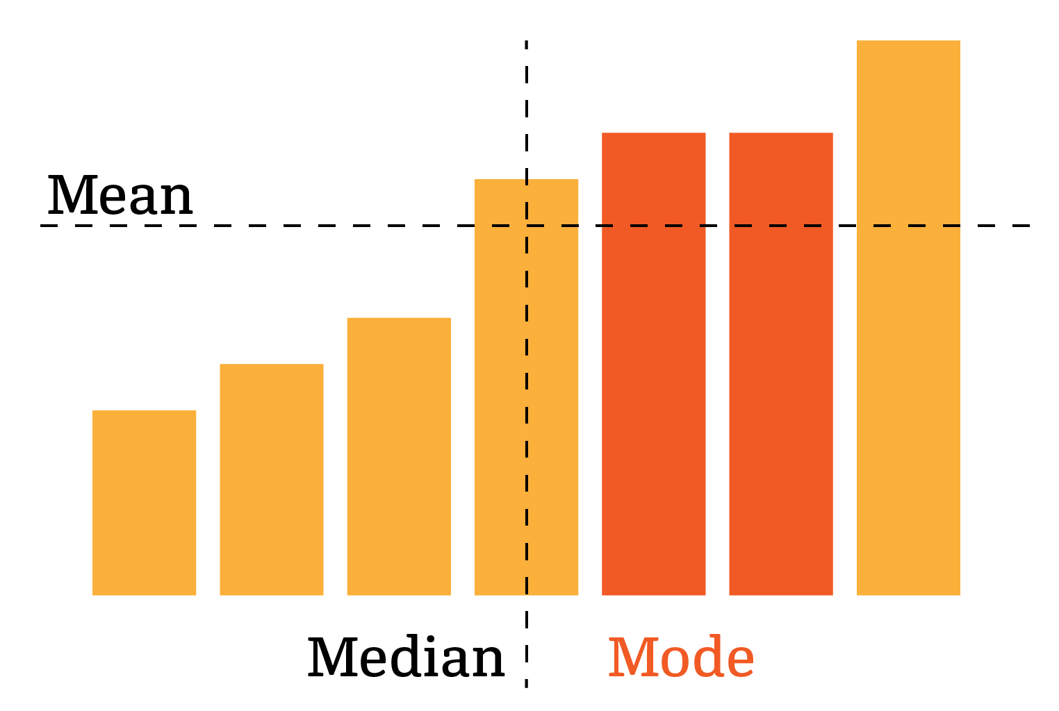
Mean
SL 4.3
The mean of a numerical dataset is the average of all the values:
xˉ=number of valuessum of values🚫
The mean is also sometimes denoted μ.
Median
SL 4.3
The median of a dataset is the middle value when the values are sorted. If a dataset has an even number of values, the median is the average of the middle two.
Mathematically, the median is the
2n+1th🚫
value. Notice that if n is even then 2n+1 is halfway between two consecutive integers, indicating we need to average their values.
Mode
SL 4.3
The mode of a dataset is the most common value in a dataset.
Quartiles and Box & Whisker Plots
4 skills
Range
SL 4.3
Range is the difference between a dataset's minimum and maximum values.
Though range may give a sense of the dispersion of a set, outliers will always have a strong effect on range since they pull the minimum or maximum values far from the rest of the data.
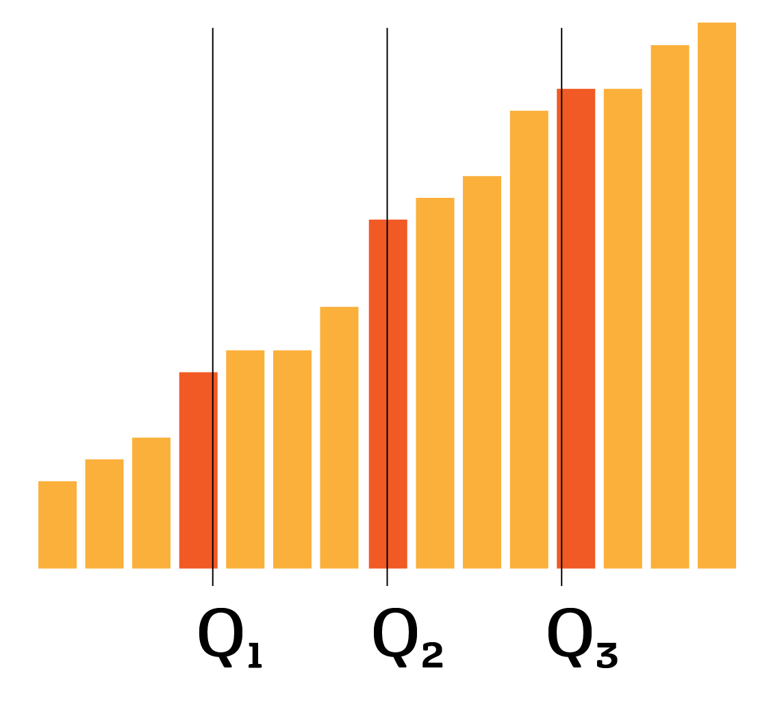
Quartiles
SL 4.3
Quartiles are conceptually similar to the median, except that there are three of them: Q1,Q2 and Q3, dividing the sorted dataset into 4 equal-size parts.
Q2 is the median, dividing the datapoints in two.
Q1 is halfway between the first value and the median.
Q3 is halfway between the median and the last value.
Interquartile Range & Outliers
SL 4.3
The interquartile range, denoted IQR, is the difference between the third and first quartile:
IQR =Q3−Q1
A value x in a dataset is said to be an outlier if x<Q1−1.5×IQR or x>Q1+1.5×IQR.
Box & Whisker Plots
SL 4.2
A box-and-whisker plot visually summarizes data by splitting it into quarters. The box shows the middle 50% of your data (from Q1 to Q3), and the line inside marks the median. The whiskers extend to show the spread of data, excluding outliers, which are marked with a cross.
- Minimum: smallest value (left whisker end)
- Lower Quartile (Q1): median of lower half (25% mark)
- Median (Q2): middle value of data set
- Upper Quartile (Q3): median of upper half (75% mark)
- Maximum: largest value (right whisker end)
Standard Deviation and Variance
2 skills
Variance & SD on Calculator (Sx vs σ)
SL 4.3
The variance σ2 of a dataset measures the spread of data around the mean.
The standard deviation σ is the square root of the variance. The advantage of the standard deviation is that is has the same units as the original data.
When you use a calculator to find standard deviation:
Enter your data into L1 using STAT > EDIT. Then, use STAT > CALC > 1-Var Stats and enter L1 as your list by clicking 2ND then 1.
You will see two values: Sx and σx. We use Sx when the data is a sample of a large population, and σx when the data represents the entire population. The difference is due to the fact that a sample will usually have a smaller variance than the population, because there are fewer elements.
Constant changes to data
SL 4.3
If we have a dataset with mean xˉ and standard deviation σ, then if we
add a constant +b to the dataset, the mean increases by b and the standard deviation does not change
scale the values by a, then both the mean and the standard deviation are scaled by a.
Frequency Tables, Histograms and cumulative frequency diagrams
5 skills
Discrete Frequency Tables
SL 4.2
Datasets can be represented in frequency tables, with a row containing the values that exist in the data and a row containing the frequency, or number of times each value appears.
The mean of frequency data can be calculated using the formula:
xˉ=ni=1∑kfixi,n=i=1∑kfi📖
If we take the above
Note that fi is the frequency of the value xi, so n=i=1∑kfi is just the total number of points.
Grouped Frequency Tables
SL 4.2
When data is continuous, we cannot have a column per possible value, as there are infinitely many.
Instead, we use a grouped frequency table to break up the data into specific intervals.
If all the intervals have equal size, then the modal class is the interval in which the most values fall.
We can also estimate the mean from grouped data as if it were a discrete frequency table using the mid-interval values, that is the average of the upper and lower bounds of each interval.
Histograms
SL 4.2
Grouped frequency tables can also be turned into histograms (aka bar graph) by drawing rectangles with base corresponding to the intervals, and heights corresponding to the frequency.
Cumulative frequency graphs and tables
SL 4.2
Cumulative frequency graphs are a powerful visual representation of continuous data.
The value of y at each point x on the curve represents the number of data points less than x.
We start with a grouped frequency table, and add a row for cumulative frequency, which is the number of items in an interval and all previous (lower) intervals. To plot the diagram, we make a point from each column. The x-coordinates are the upper bound of each interval, and the y-coordinates are the cumulative frequency.
Median, quartiles & percentiles on CF Graphs
SL 4.2
Cumulative frequency diagrams can be used to find medians, quartiles, and percentiles.
In the same way that the first quartile, Q1, is the value greater than a quarter (25%) of data values, the kth percentile is the value greater than k% of the data values.
Q1: 0.25× the max
Median: 0.5× the max
Q3: 0.75× the max
kth percentile: 100k× the max.
Data Collection
3 skills
Designing Surveys
AHL AI 4.12
If you've taken a survey before, you know that they can be very poorly designed. We've compiled below some examples of terrible survey questions:
Question
Why it's terrible
How much do you love Perplex?
Biased question, people don't like to be too critical
How often do your parents argue about money at home?
Too personal
Tell me about your mental health.
Unstructured! I don't know what you're asking
How many hours do you study each week?
Never
3
Quite a lot
Yes
Inconsistent answer choices
Reliability of a measurement
AHL AI 4.12
When we use statistics to come to a conclusion, the reliability of the conclusion describes how consistent the variables we measured are.
To determine if a measurement is reliable, we ask ourselves whether we would get similar results redoing the same experiment, with the same sample.
An example of an unreliable test is a lab analysis of cholesterol level. The same person could have their blood tested just days apart and get significantly different results. The measurement can be made more reliable in a variety of ways, but at its core unreliability is a measure of how much the result would vary if we redid it many times.
There are two ways to measure reliability that the IB wants you to know:
Test-retest reliability
This just means redoing the measurement sometime later and comparing how much the results change. In some cases (like the cholesterol example) this is a great approach, but in others it works less well.
Imagine measuring drivers' knowledge of road laws by giving them a test. If we re-test them a week later, they would likely have learned from the test and might perform better.
Parallel forms reliability
This approach is specifically used to assess humans. It involves giving participants two similar versions of the same test, and seeing how close their performance on one is to the other.
Validity of a test
AHL AI 4.12
Statistical validity describes how accurately the thing we measured represents what we're interested in.
For example, consider a military fitness test. A test that only measures one trait, like how fast you can run a 5km race, simply doesn't test all the relevant types of physical fitness. This kind of test has a low content validity, because it only measures one small aspect of the domain we care about.
The second kind of validity the IB expects you to know is called criterion validity. The criterion is the thing you actually care about, and the criterion validity measures how well a test predicts the criterion.
A real world example is a polygraph (lie detector test). It's supposed to measure whether a person is lying, but in reality only measures how nervous they are.